exam <- read_csv("data/data_04/Exam_Data.csv",
show_col_types = FALSE)Week 4: Hands-on Exercise
Disclaimer
Hands-on exercises are for my own practice and are ungraded. Thus, the plots and write-ups may be unrefined and poorly labelled.
Visualising distributions of data
Load packages
ggridgesis aggplot2extension for plotting ridgeline plots;ggdistis an extension for visualising distributions and uncertainty.
Load dataset
Using ggridges
Two ‘geoms’ can be used:
geom_ridgeline()uses the specified height values to draw ridgelines;geom_density_ridges()estimates data densities to draw ridgelines.
Demonstration using the latter:
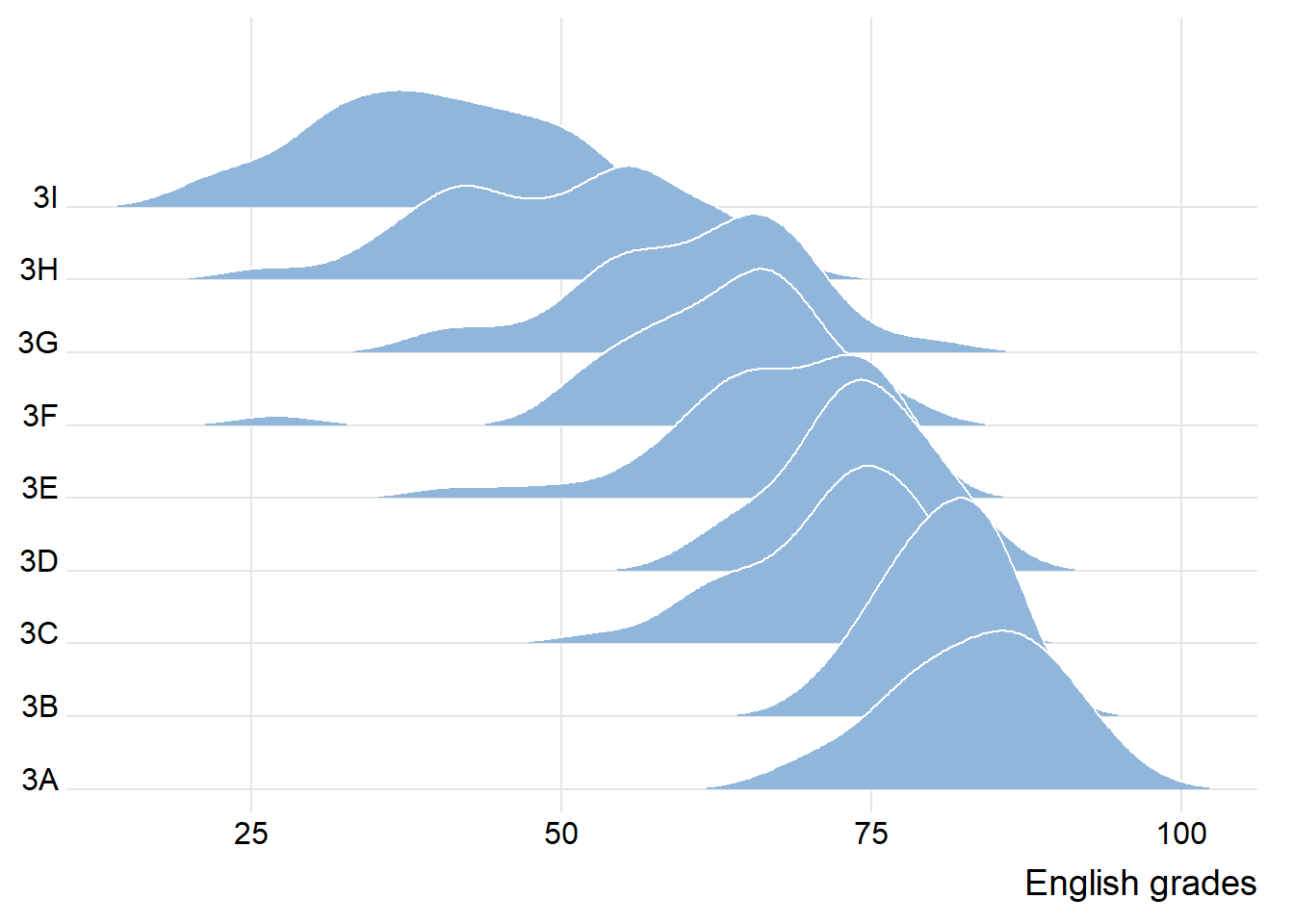
ggplot(exam,
       aes(x = ENGLISH,
           y = CLASS)) +
  geom_density_ridges(
    scale = 3,
    rel_min_height = 0.01,
    bandwidth = 3.4,
    fill = lighten("#7097BB", .3),
    color = "white"
  ) +
  scale_x_continuous(
    name = "English grades",
    expand = c(0, 0)
    ) +
  scale_y_discrete(name = NULL, expand = expansion(add = c(0.2, 2.6))) +
  theme_ridges()
Adding colour
Colour can be added in a few ways:
Based on the value along the x-axis;
Based on cumulative density function (cdf) values.
Based on quantiles
Based on cut-off points
Demonstration of the respective ways can be found below:
By x-axis value
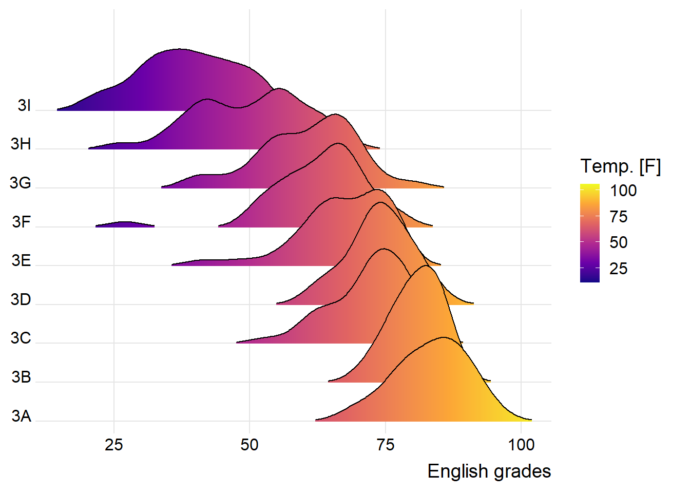
ggplot(exam,
       aes(x = ENGLISH,
           y = CLASS,
           fill = stat(x))) +
  geom_density_ridges_gradient(
    scale = 3,
    rel_min_height = 0.01) +
  scale_fill_viridis_c(name = "Temp. [F]",
                       option = "C") +
  scale_x_continuous(
    name = "English grades",
    expand = c(0, 0)
  ) +
  scale_y_discrete(name = NULL, expand = expansion(add = c(0.2, 2.6))) +
  theme_ridges()
By cdf value
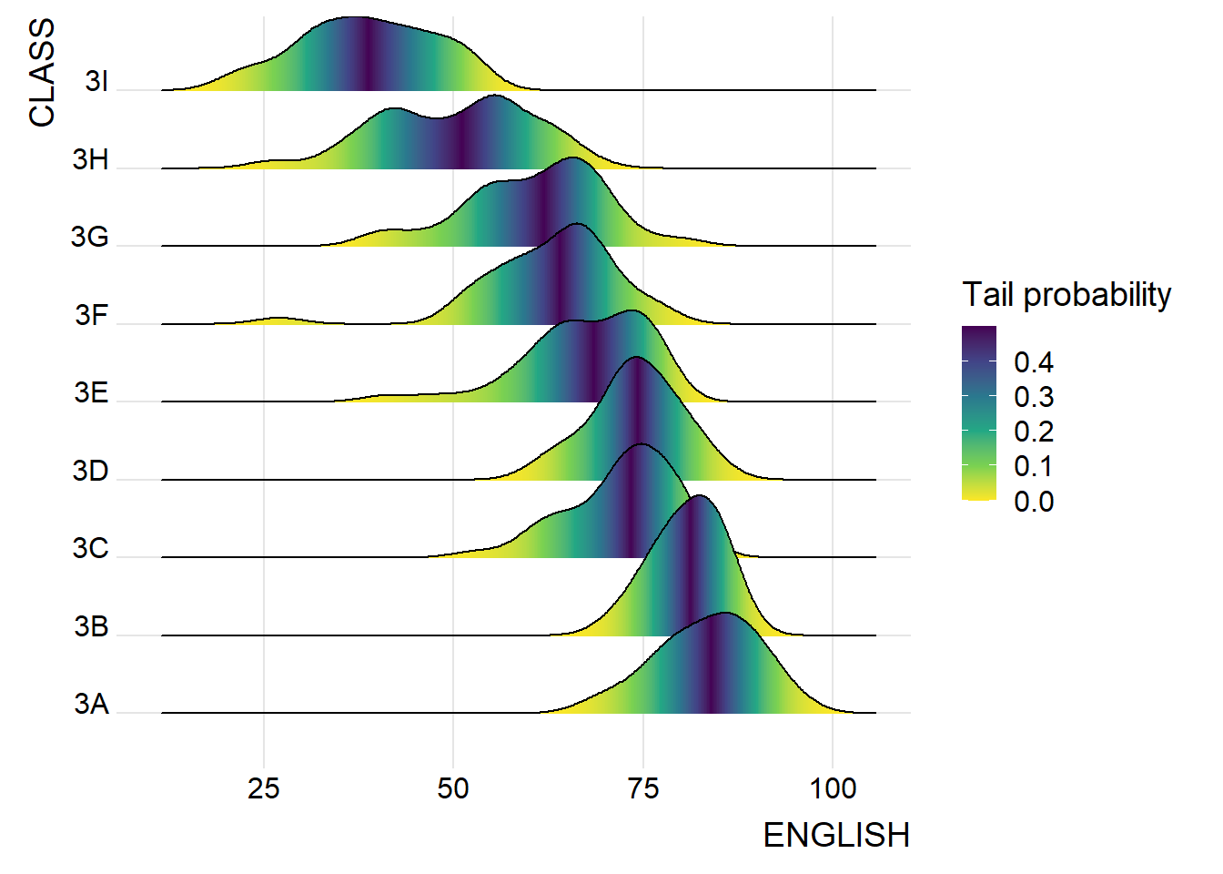
ggplot(exam,
       aes(x = ENGLISH,
           y = CLASS,
           fill = 0.5 - abs(0.5-stat(ecdf)))) +
  stat_density_ridges(geom = "density_ridges_gradient",
                      calc_ecdf = TRUE) + # note: this line is important
  scale_fill_viridis_c(name = "Tail probability",
                       direction = -1) +
  theme_ridges()
By quantiles
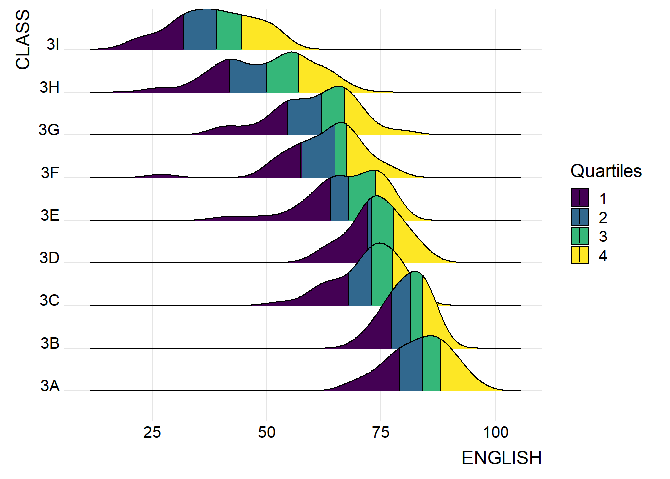
ggplot(exam,
       aes(x = ENGLISH,
           y = CLASS,
           fill = factor(stat(quantile))
           )) +
  stat_density_ridges(
    geom = "density_ridges_gradient",
    calc_ecdf = TRUE,
    quantiles = 4,
    quantile_lines = TRUE) +
  scale_fill_viridis_d(name = "Quartiles") +
  theme_ridges()
By cut-off point
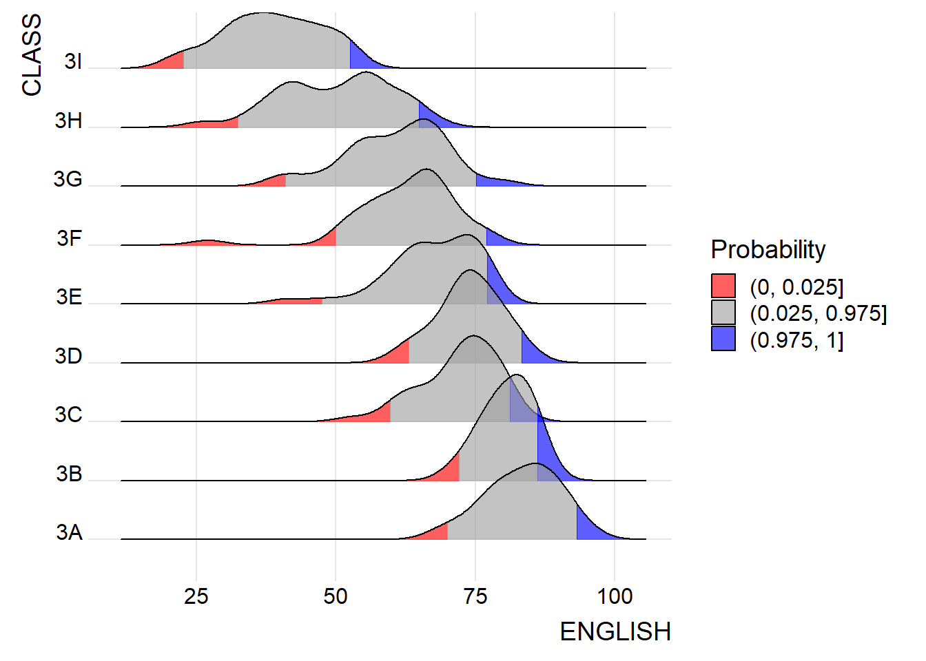
ggplot(exam,
       aes(x = ENGLISH,
           y = CLASS,
           fill = factor(stat(quantile))
           )) +
  stat_density_ridges(
    geom = "density_ridges_gradient",
    calc_ecdf = TRUE,
    quantiles = c(0.025, 0.975)
    ) +
  scale_fill_manual(
    name = "Probability",
    values = c("#FF0000A0", "#A0A0A0A0", "#0000FFA0"),
    labels = c("(0, 0.025]", "(0.025, 0.975]", "(0.975, 1]")
  ) +
  theme_ridges()
Plotting Raincloud plots
An example can be found below:
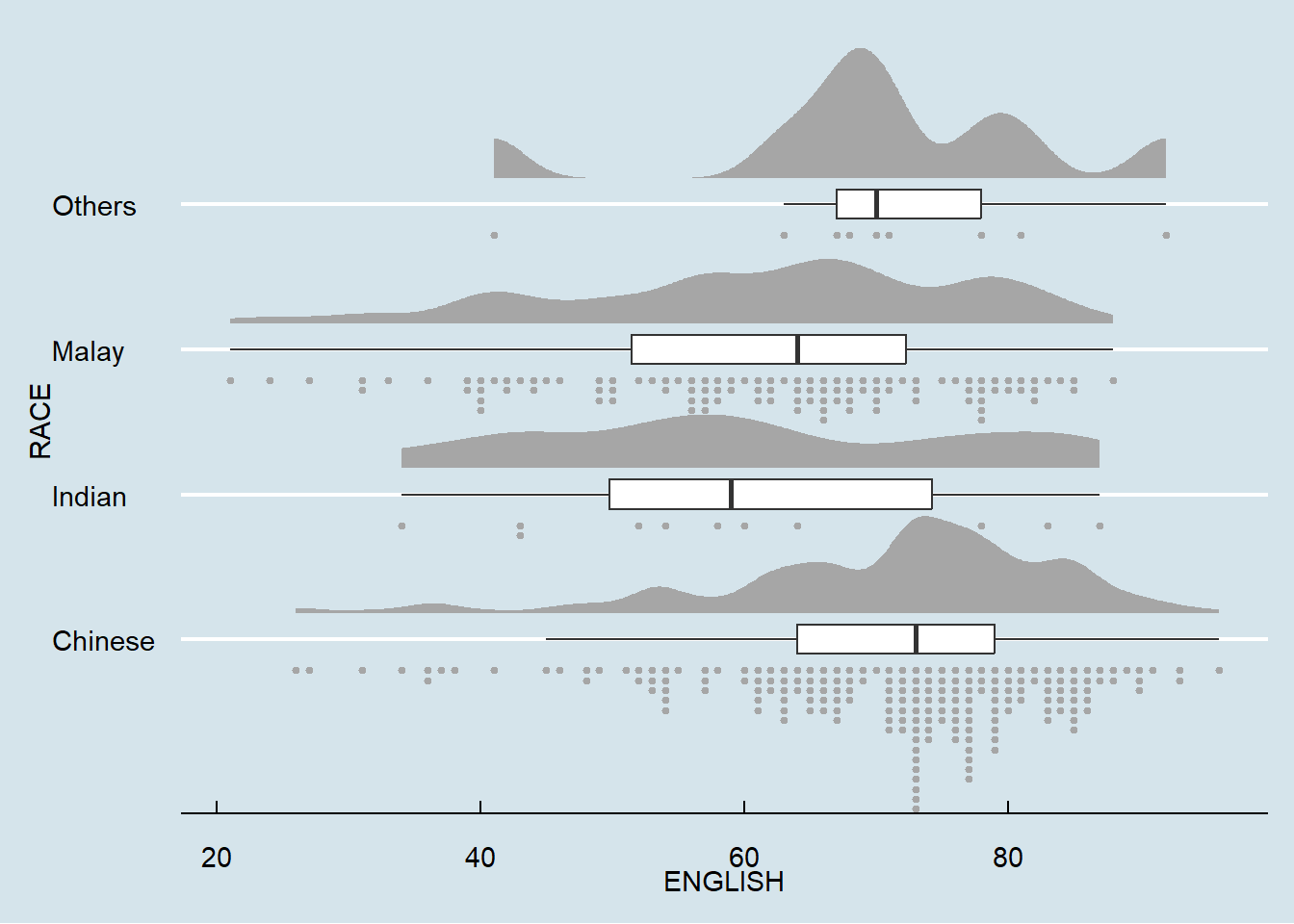
ggplot(exam,
       aes(x = RACE,
           y = ENGLISH)) +
  stat_halfeye(adjust = 0.5,
               justification = -0.2,
               .width = 0,
               point_colour = NA) +
  geom_boxplot(width = .20,
               outlier.shape = NA) +
  stat_dots(side = "left",
            justification = 1.2,
            binwidth = .5,
            dotsize = 1.5) +
  coord_flip() +
  theme_economist()