Hands-on exercises are for my own practice and are ungraded. Thus, the plots and write-ups may be unrefined and poorly labelled.
Let’s explore the ggplot2 package in R!
Load dataset
<- read_csv ("data/data_01/Exam_data.csv" )
Rows: 322 Columns: 7
── Column specification ────────────────────────────────────────────────────────
Delimiter: ","
chr (4): ID, CLASS, GENDER, RACE
dbl (3): ENGLISH, MATHS, SCIENCE

ℹ Use `spec()` to retrieve the full column specification for this data.
ℹ Specify the column types or set `show_col_types = FALSE` to quiet this message.
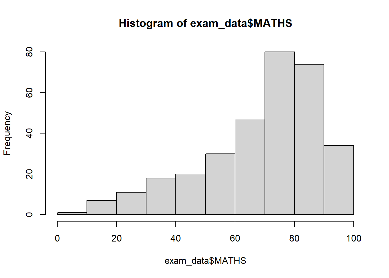
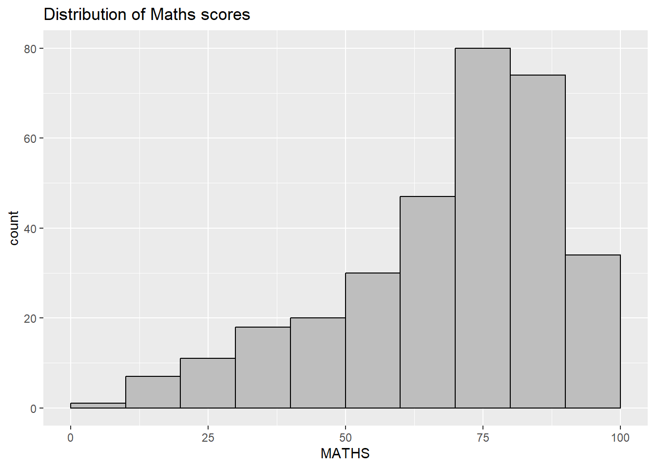
Comparing R graphics with ggplot2
ggplot (data= exam_data, aes (x = MATHS)) + geom_histogram (bins= 10 , boundary = 100 ,color= "black" , fill= "grey" ) + ggtitle ("Distribution of Maths scores" )
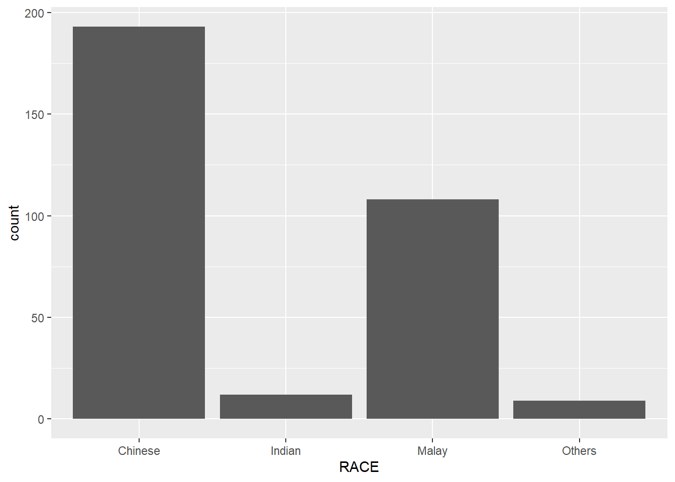
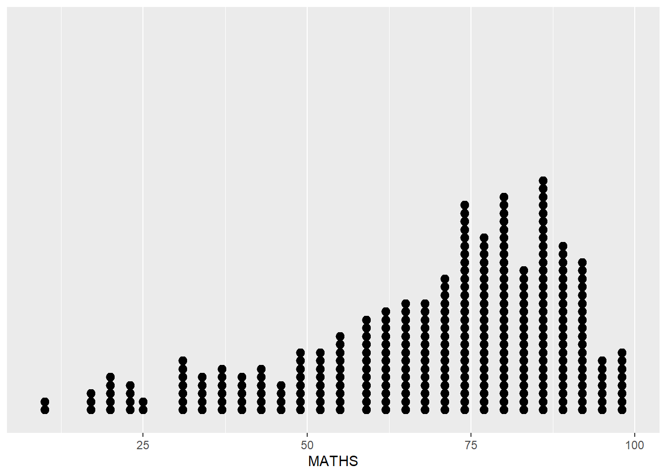
Exploring ggplot2
ggplot (data = exam_data,aes (x = RACE)) + geom_bar ()
ggplot (data = exam_data,aes (x = MATHS)) + geom_dotplot (dotsize = 0.5 ,binwidth = 2.5 ) + scale_y_continuous (NULL ,breaks = NULL )
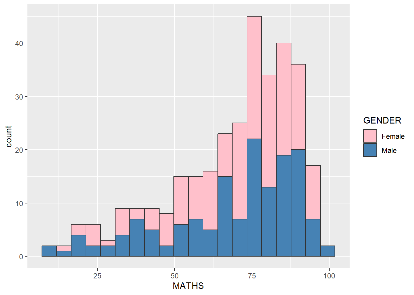
ggplot (data = exam_data,aes (x = MATHS,fill = GENDER)) + geom_histogram (bins = 20 ,color = "grey20" ) + scale_fill_manual (values = c ("pink" , "steelblue" ))
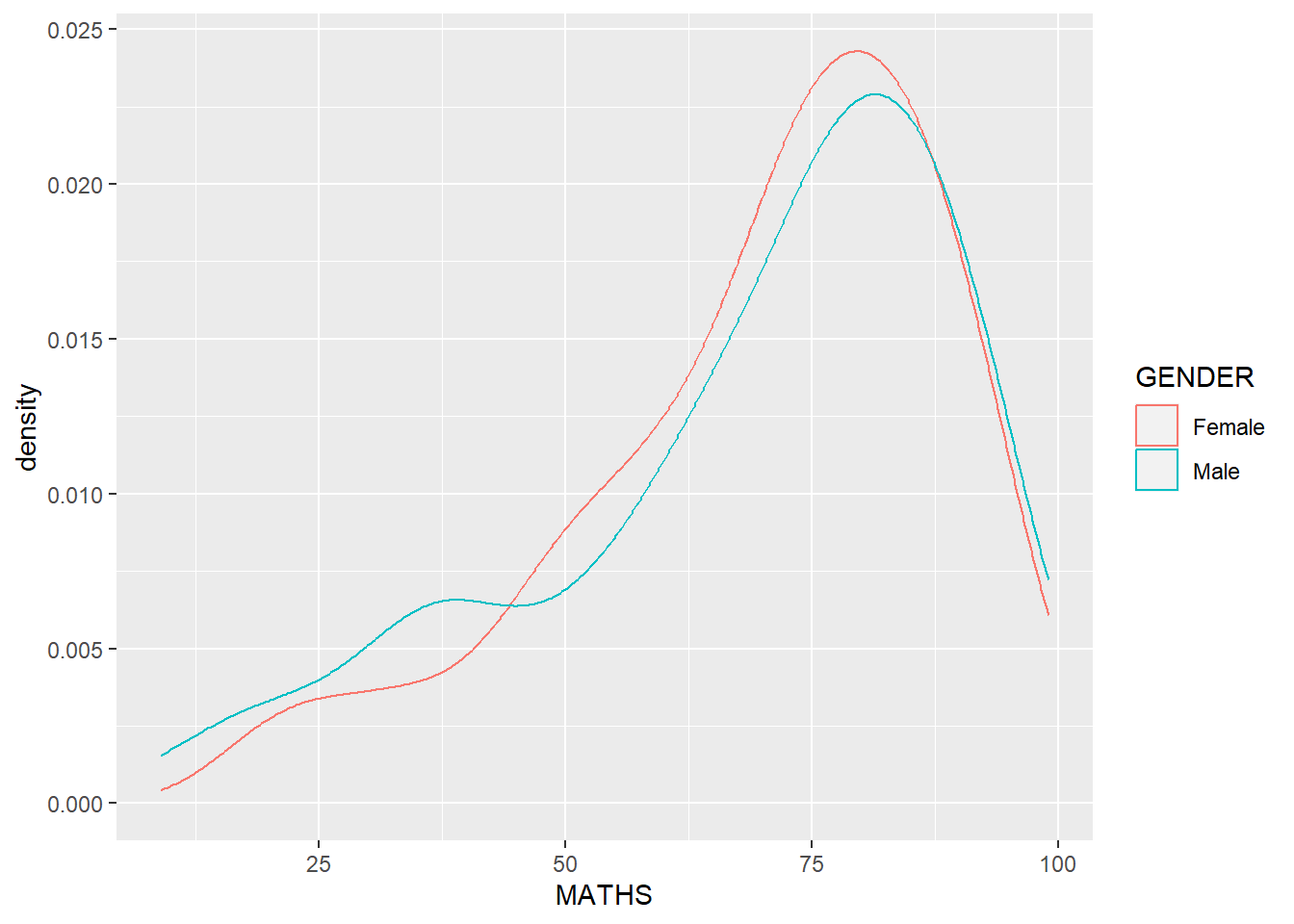
ggplot (data = exam_data,aes (x = MATHS,color = GENDER)) + geom_density ()
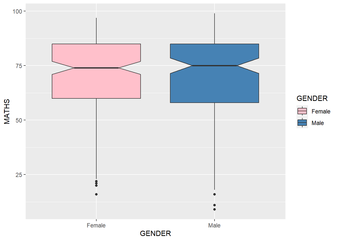
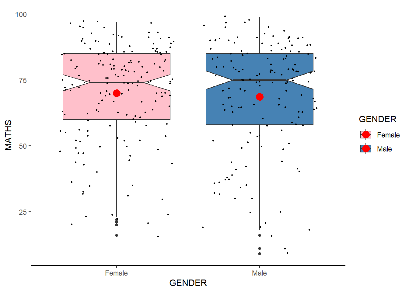
ggplot (data = exam_data,aes (y = MATHS,x = GENDER,fill = GENDER)) + geom_boxplot (notch = TRUE ) + scale_fill_manual (values = c ("pink" , "steelblue" ))
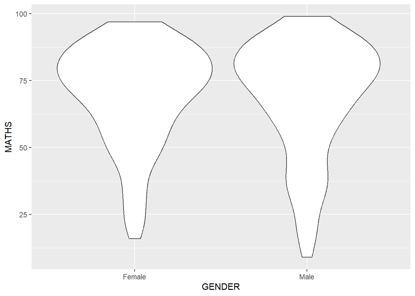
ggplot (data = exam_data,aes (y = MATHS,x = GENDER)) + geom_violin ()
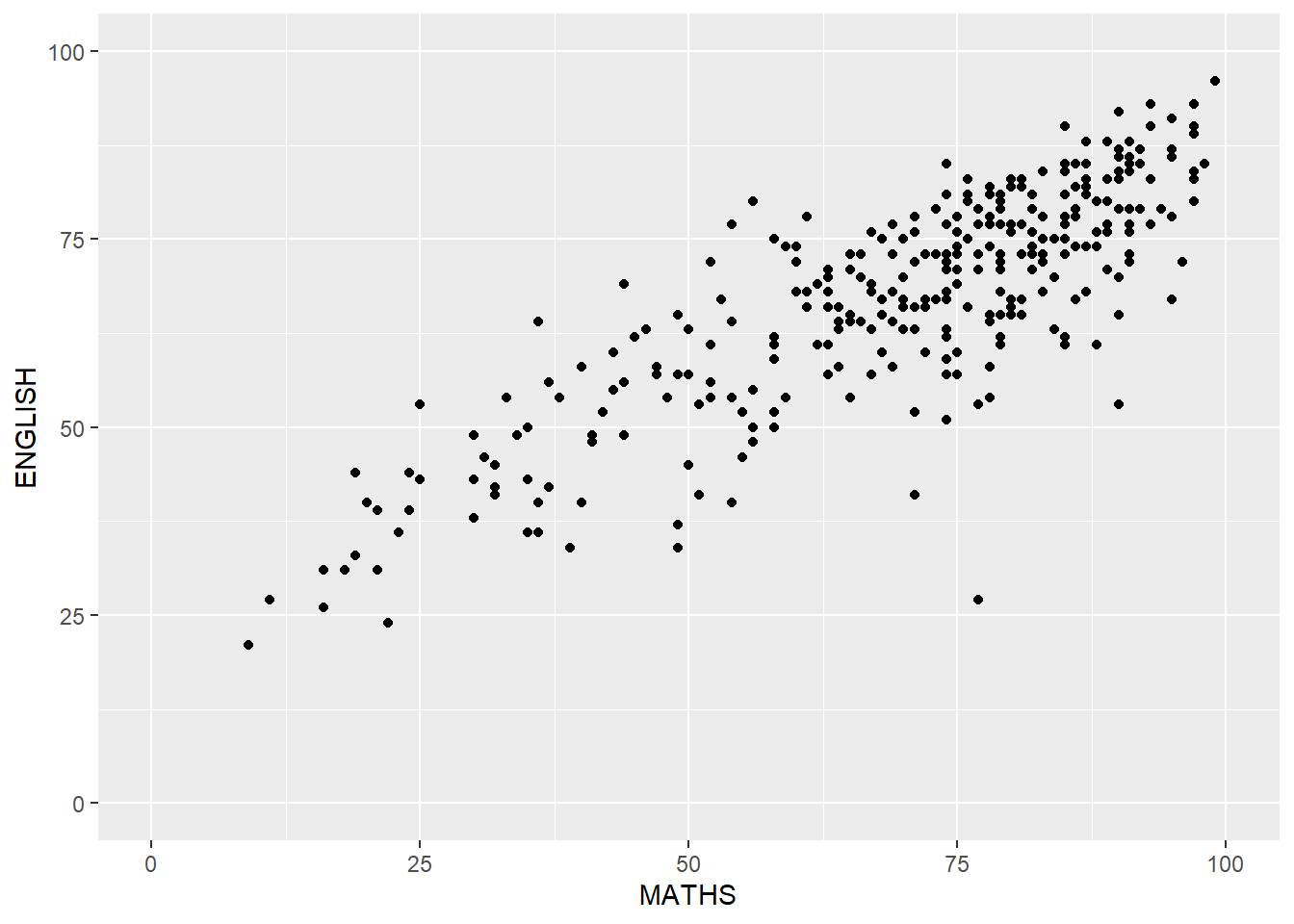
ggplot (data = exam_data,aes (x = MATHS,y = ENGLISH)) + geom_point () + coord_cartesian (xlim = c (0 , 100 ),ylim = c (0 , 100 ))
Some other elements…
Combining geom objects + stat
ggplot (data = exam_data,aes (y = MATHS,x = GENDER,fill = GENDER)) + geom_boxplot (notch = TRUE ) + geom_point (position = "jitter" ,size = 0.5 ) + scale_fill_manual (values = c ("pink" , "steelblue" )) + stat_summary (geom = "point" ,fun = "mean" ,colour = "red" ,size = 4 ) + theme_classic ()
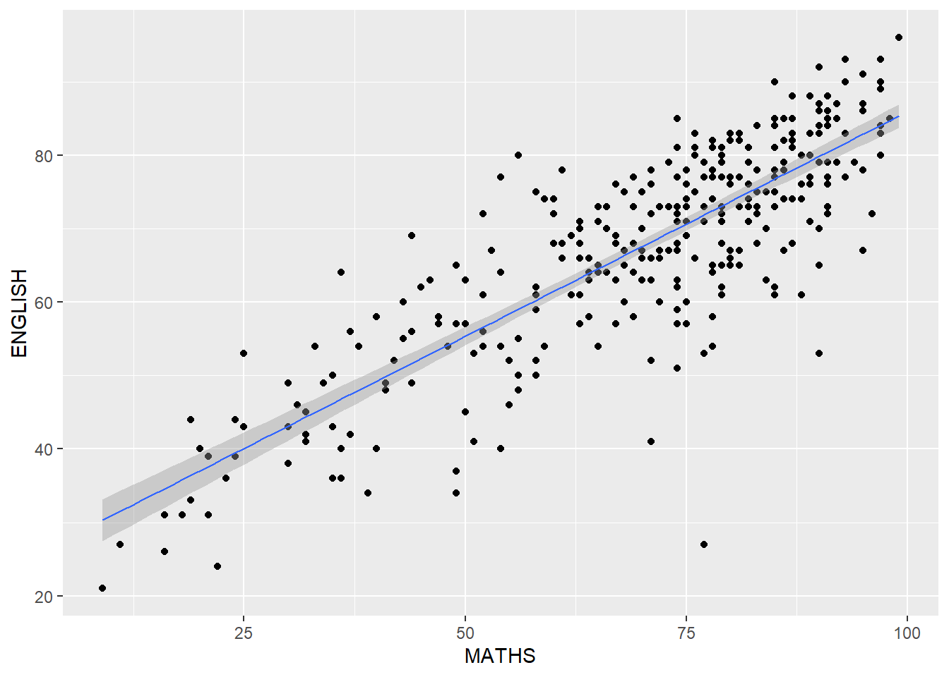
Scatterplot with best fit line!
ggplot (data = exam_data,aes (x = MATHS,y = ENGLISH)) + geom_point () + geom_smooth (method = lm,linewidth = 0.5 )
`geom_smooth()` using formula = 'y ~ x'
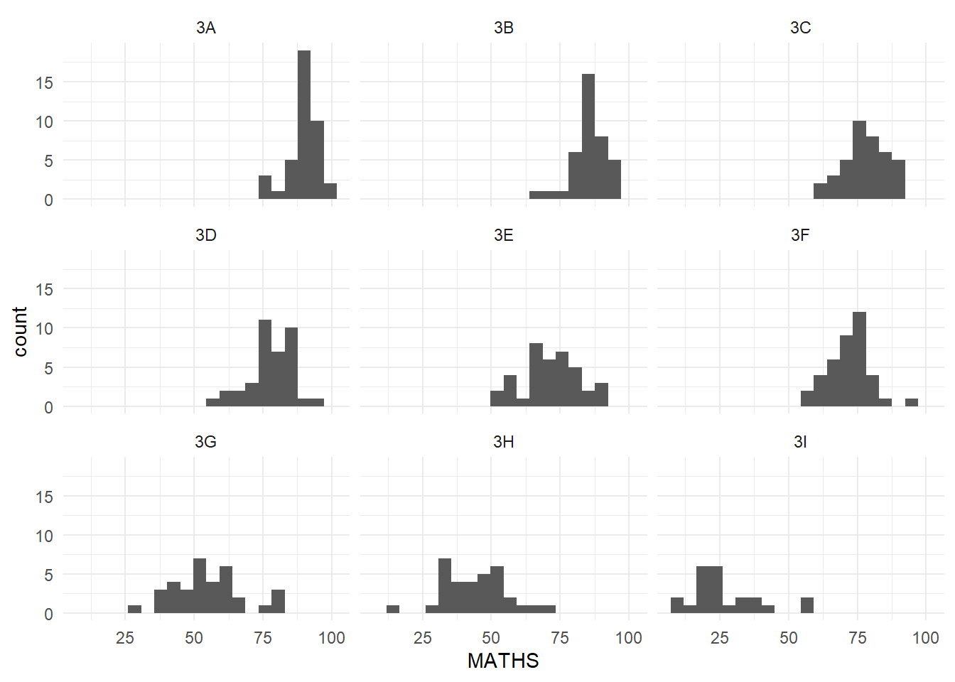
Working with facets
ggplot (data = exam_data,aes (x = MATHS)) + geom_histogram (bins = 20 ) + facet_wrap (~ CLASS) + theme_minimal ()
And that’s it for Week 1!