Hands-on exercises are for my own practice and are ungraded. Thus, the plots and write-ups may be unrefined and poorly labelled.
Load dataset
<- read_csv ("data/data_02/Exam_data.csv" )
Rows: 322 Columns: 7
── Column specification ────────────────────────────────────────────────────────
Delimiter: ","
chr (4): ID, CLASS, GENDER, RACE
dbl (3): ENGLISH, MATHS, SCIENCE

ℹ Use `spec()` to retrieve the full column specification for this data.
ℹ Specify the column types or set `show_col_types = FALSE` to quiet this message.
Why use ggrepel?
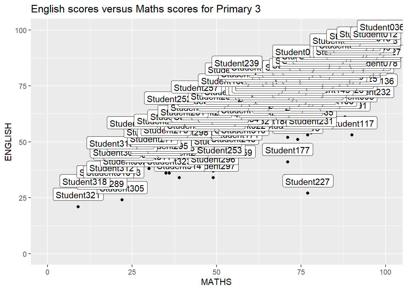
When there is a large number of data points, it may become difficult to annotate the graph using traditional ggplot2:
ggplot (data= exam_data, aes (x= MATHS, y= ENGLISH)) + geom_point () + geom_smooth (method= lm, linewidth= 0.5 ) + geom_label (aes (label = ID), hjust = .5 , vjust = - .5 ) + coord_cartesian (xlim= c (0 ,100 ),ylim= c (0 ,100 )) + ggtitle ("English scores versus Maths scores for Primary 3" )
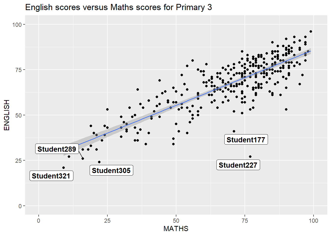
To use ggrepel, we just need to replace geom_text() by geom_text_repel() and geom_label() by geom_label_repel()
Example of using ggrepel
Warning: Using `size` aesthetic for lines was deprecated in ggplot2 3.4.0.
ℹ Please use `linewidth` instead.
Warning: ggrepel: 317 unlabeled data points (too many overlaps). Consider
increasing max.overlaps
ggplot (data= exam_data, aes (x= MATHS, y= ENGLISH)) + geom_point () + geom_smooth (method= lm, size= 0.5 ) + geom_label_repel (aes (label = ID), fontface = "bold" ) + coord_cartesian (xlim= c (0 ,100 ),ylim= c (0 ,100 )) + ggtitle ("English scores versus Maths scores for Primary 3" )
Warning: ggrepel: 317 unlabeled data points (too many overlaps). Consider
increasing max.overlaps
Themes! Themes! Cool themes! From ggtheme package
While ggplot2 has some built-in themes such as theme_gray(), theme_bw(), theme_classic(), theme_dark(), theme_light(), theme_linedraw(), theme_minimal(), and theme_void(), we can also use some cool themes from ggtheme.
Using hrbthemes package
hrbthemes focuses on typographic elements, allowing you to customize label placements and fonts used.
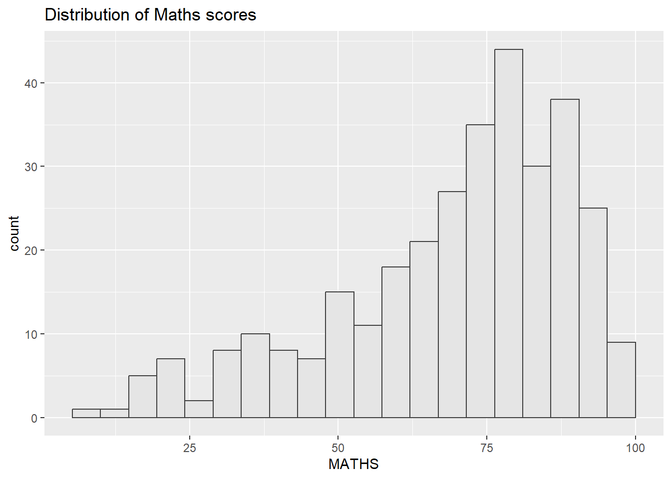
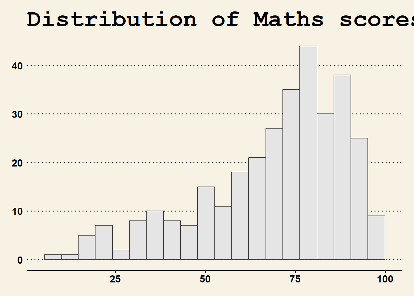
ggplot (data= exam_data, aes (x = MATHS)) + geom_histogram (bins= 20 , boundary = 100 ,color= "grey25" , fill= "grey90" ) + ggtitle ("Distribution of Maths scores" ) + theme_ipsum (axis_title_size = 18 ,base_size = 15 ,grid = "" )
axis_title_size alters the font size of the axis title
base_size messes with the default axis labels
grid determines whether you see grids. It accepts the following values: TRUE, FALSE, X, x, Y, y, or a combination, i.e., XY
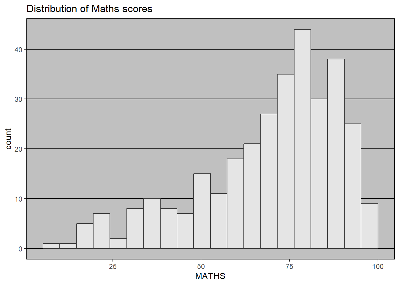
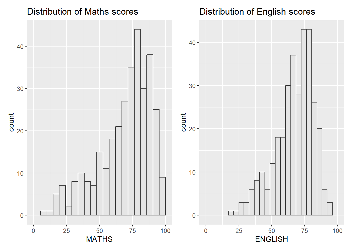
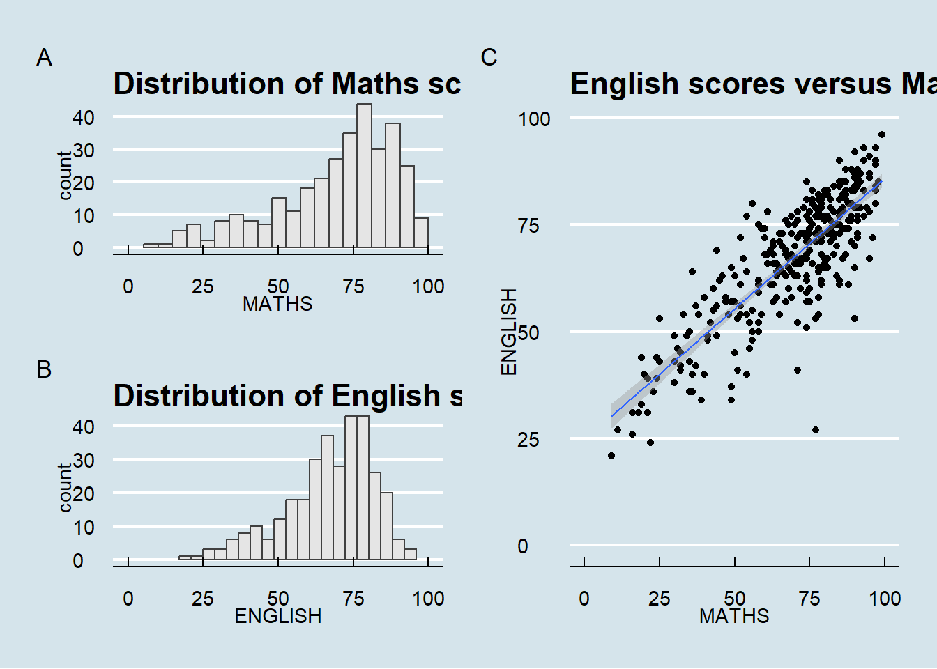
patchwork! Patching multiple graphs togetherImagine that you have multiple graphs:
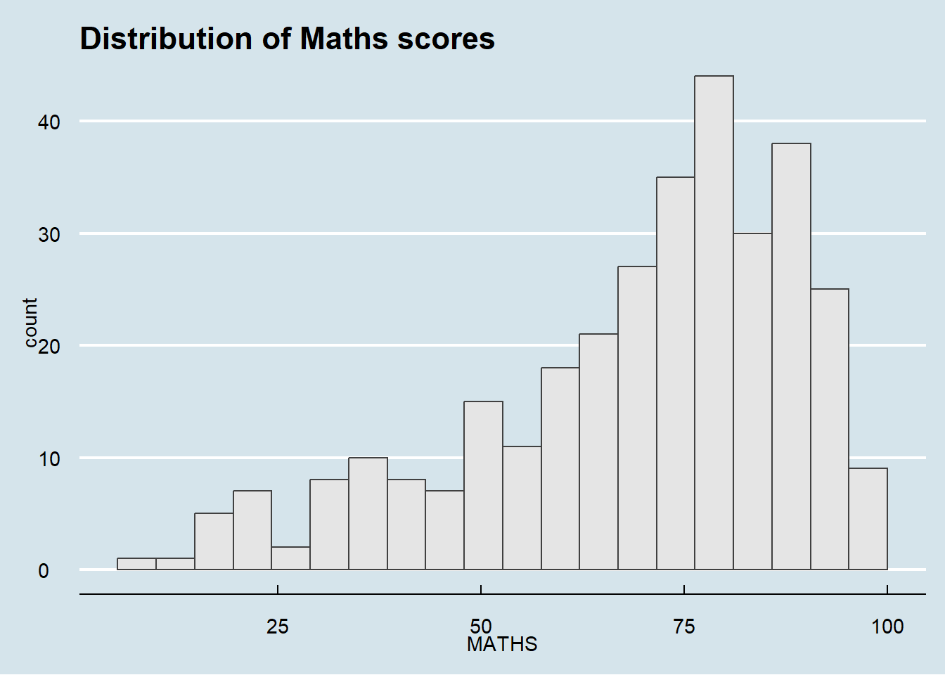
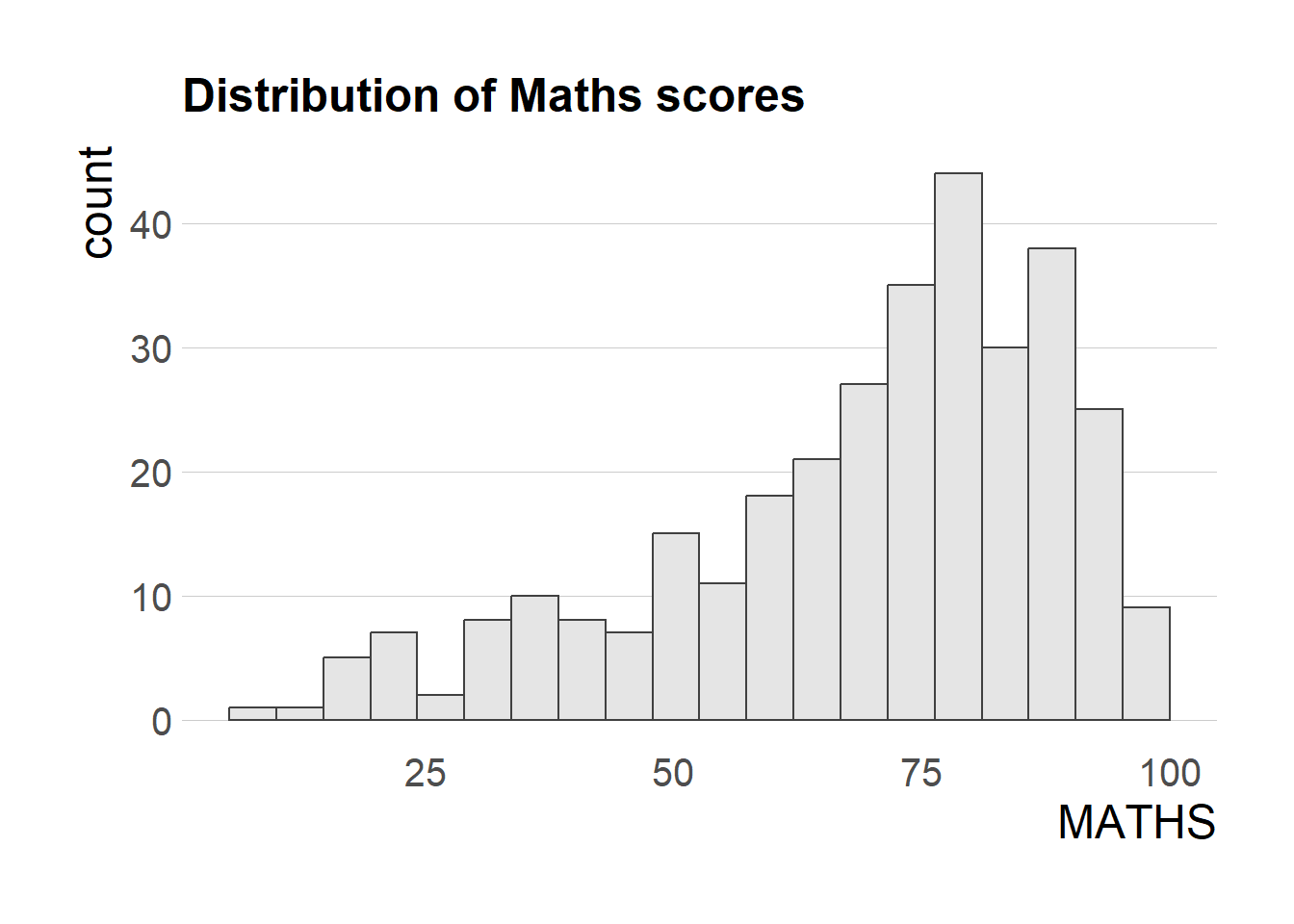
<- ggplot (data= exam_data, aes (x = MATHS)) + geom_histogram (bins= 20 , boundary = 100 ,color= "grey25" , fill= "grey90" ) + coord_cartesian (xlim= c (0 ,100 )) + ggtitle ("Distribution of Maths scores" )
<- ggplot (data= exam_data, aes (x = ENGLISH)) + geom_histogram (bins= 20 , boundary = 100 ,color= "grey25" , fill= "grey90" ) + coord_cartesian (xlim= c (0 ,100 )) + ggtitle ("Distribution of English scores" )
<- ggplot (data= exam_data, aes (x= MATHS, y= ENGLISH)) + geom_point () + geom_smooth (method= lm, size= 0.5 ) + coord_cartesian (xlim= c (0 ,100 ),ylim= c (0 ,100 )) + ggtitle ("English scores versus Maths scores for Primary 3" )
You can combine two graphs together side by side:
Or combine three of them using the following operators:
“|” operator to place the plots side by side
“/” operator to stack one on top of another
“()” operator the define the sequence of plotting
And also add the following:
plot_annotation(), which will automatically tag the different figuresinset_element(), which will add another plot based on your specified position (not demonstrated)
/ p2) | p3) + plot_annotation (tag_levels = 'A' ) & theme_economist ()