ISSS608 Visual Analytics & Applications Coursework
by Wilson Tan
  • Hands-on Exercises
    • Week 1: Hands-on Exercise
    • Week 2: Hands-on Exercise
    • Week 3: Hands-on Exercise
    • Week 4: Hands-on Exercise
  • In-class Exercises
    • Week 1: In-class Exercise
    • Week 2: In-class Exercise
    • Week 3: In-class Exercise
    • Week 4: In-class Exercise
    • Week 5: In-class Exercise
    • Week 6: In-class Exercise
    • Week 7: In-class Exercise
  • Take-home Exercises
    • Take-home Exercise 01
    • Take-home Exercise 02
    • Take-home Exercise 03

Week 3: Hands-on Exercise

Disclaimer

Hands-on exercises are for my own practice and are ungraded. Thus, the plots and write-ups may be unrefined and poorly labelled.

Load dataset

exam_data <- read_csv("data/data_03/Exam_data.csv")
Rows: 322 Columns: 7
── Column specification ────────────────────────────────────────────────────────
Delimiter: ","
chr (4): ID, CLASS, GENDER, RACE
dbl (3): ENGLISH, MATHS, SCIENCE

ℹ Use `spec()` to retrieve the full column specification for this data.
ℹ Specify the column types or set `show_col_types = FALSE` to quiet this message.

ggiraph is a ggplot2 extension that can allow plots to become interactive. Three arguments are accepted:

  • Tooltip

  • Onclick

  • Data_id

Its usage will be demonstrated via the example code chunks below.

Tooltip aesthetic

exam_data$tooltip <- c(paste0(     
  "Name = ", exam_data$ID,         
  "\n Class = ", exam_data$CLASS))

p <- ggplot(data=exam_data, 
       aes(x = MATHS)) +
  geom_dotplot_interactive(
    aes(tooltip = exam_data$tooltip),
    stackgroups = TRUE, 
    binwidth = 1, 
    method = "histodot") +
  scale_y_continuous(NULL, 
                     breaks = NULL)
girafe(
  ggobj = p,
  width_svg = 8,
  height_svg = 8*0.618
)
How to achieve interactivity?

Use the interactive version of ggplot2 geom functions. Then, use girafe() to generate an svg object to be displayed on an html page.

In this example, hovering over data points reveal the student’s name and class for that data point.

Further customization

ggiraph objects can be customized via options = and opts_tooltip() by adding css declarations.

You can also display statistics on tooltips!

tooltip <- function(y, ymax, accuracy = .01) {
  mean <- scales::number(y, accuracy = accuracy)
  sem <- scales::number(ymax - y, accuracy = accuracy)
  paste("Mean maths scores:", mean, "+/-", sem)
}

gg_point <- ggplot(data=exam_data, 
                   aes(x = RACE),
) +
  stat_summary(aes(y = MATHS, 
                   tooltip = after_stat(  
                     tooltip(y, ymax))),  
    fun.data = "mean_se", 
    geom = GeomInteractiveCol,  
    fill = "light blue"
  ) +
  stat_summary(aes(y = MATHS),
    fun.data = mean_se,
    geom = "errorbar", width = 0.2, size = 0.2
  )
Warning: Using `size` aesthetic for lines was deprecated in ggplot2 3.4.0.
ℹ Please use `linewidth` instead.
girafe(ggobj = gg_point,
       width_svg = 8,
       height_svg = 8*0.618)

Data_id aesthetic

p <- ggplot(data=exam_data,
       aes(x = MATHS)) +
  geom_dotplot_interactive(              
    aes(tooltip = CLASS, 
        data_id = CLASS),              
    stackgroups = TRUE,                  
    binwidth = 1,                        
    method = "histodot") +               
  scale_y_continuous(NULL,               
                     breaks = NULL)
girafe(                                  
  ggobj = p,                             
  width_svg = 6,                         
  height_svg = 6*0.618
)                                                                     
Interactivity

Elements associated with a certain data_id will be highlighted when your cursor hovers over a data point with that data_id. In this example, this was achieved in addition to the tooltip aesthetic (that will display the data_id).

Onclick aesthetic

onclick can be used to hyperlink to other websites on the Internet.

exam_data$onclick <- sprintf("window.open(\"%s%s\")",
"https://www.moe.gov.sg/schoolfinder?journey=Primary%20school",
as.character(exam_data$ID))

p <- ggplot(data=exam_data, 
       aes(x = MATHS)) +
  geom_dotplot_interactive(              
    aes(onclick = onclick),              
    stackgroups = TRUE,                  
    binwidth = 1,                        
    method = "histodot") +               
  scale_y_continuous(NULL,               
                     breaks = NULL)
girafe(                                  
  ggobj = p,                             
  width_svg = 6,                         
  height_svg = 6*0.618)                               
Javascript instructions

Note the additional column created in the dataset exam_data called onclick that specifies the javascript to open a window with the given URL. This is necessary to make onclick work!

Coordinating between two plots

patchwork can be used with what we have learnt today as well! The two plots will show the data points with the same data_id upon cursor hover:

p1 <- ggplot(data=exam_data, 
       aes(x = MATHS)) +
  geom_dotplot_interactive(              
    aes(data_id = ID,
        tooltip = ID),              
    stackgroups = TRUE,                  
    binwidth = 1,                        
    method = "histodot") +  
  coord_cartesian(xlim=c(0,100)) + 
  scale_y_continuous(NULL,               
                     breaks = NULL)

p2 <- ggplot(data=exam_data, 
       aes(x = ENGLISH)) +
  geom_dotplot_interactive(              
    aes(data_id = ID,
        tooltip = ID),              
    stackgroups = TRUE,                  
    binwidth = 1,                        
    method = "histodot") + 
  coord_cartesian(xlim=c(0,100)) + 
  scale_y_continuous(NULL,               
                     breaks = NULL)

girafe(code = print(p1 + p2), 
       width_svg = 6,
       height_svg = 3,
       options = list(
         opts_hover(css = "fill: #202020;"),
         opts_hover_inv(css = "opacity:0.2;")
         )
       ) 

Using plotly methods to achieve interactive data visualization

There are two ways of doing this:

  • plot_ly()

  • ggplotly()

  • plot_ly()
  • Code
plot_ly(data = exam_data, 
        x = ~ENGLISH, 
        y = ~MATHS, 
        color = ~RACE)
  • ggplotly()
  • Code
p <- ggplot(data=exam_data, 
            aes(x = MATHS,
                y = ENGLISH,
                color = RACE)) +
  geom_point(size=1) +
  coord_cartesian(xlim=c(0,100),
                  ylim=c(0,100))
ggplotly(p)

You can achieve a coordinated linked plot using highlight_key() and subplot() to place the plots side by side.

  • plot_ly()
  • Code
plot_ly(data = exam_data, 
        x = ~ENGLISH, 
        y = ~MATHS, 
        color = ~RACE)
  • Plot
  • Code
d <- highlight_key(exam_data)
p1 <- ggplot(data=d, 
            aes(x = MATHS,
                y = ENGLISH)) +
  geom_point(size=1) +
  coord_cartesian(xlim=c(0,100),
                  ylim=c(0,100))

p2 <- ggplot(data=d, 
            aes(x = MATHS,
                y = SCIENCE)) +
  geom_point(size=1) +
  coord_cartesian(xlim=c(0,100),
                  ylim=c(0,100))
subplot(ggplotly(p1),
        ggplotly(p2))

Using crosstalk methods

Example of usage below:

d <- highlight_key(exam_data[c('ID', 'CLASS', 'GENDER', 'RACE', 'ENGLISH','MATHS', 'SCIENCE')]) 
p <- ggplot(d, 
            aes(ENGLISH, 
                MATHS)) + 
  geom_point(size=1) +
  coord_cartesian(xlim=c(0,100),
                  ylim=c(0,100))

gg <- highlight(ggplotly(p),        
                "plotly_selected")  

crosstalk::bscols(gg,               
                  DT::datatable(d), 
                  widths = 4)        

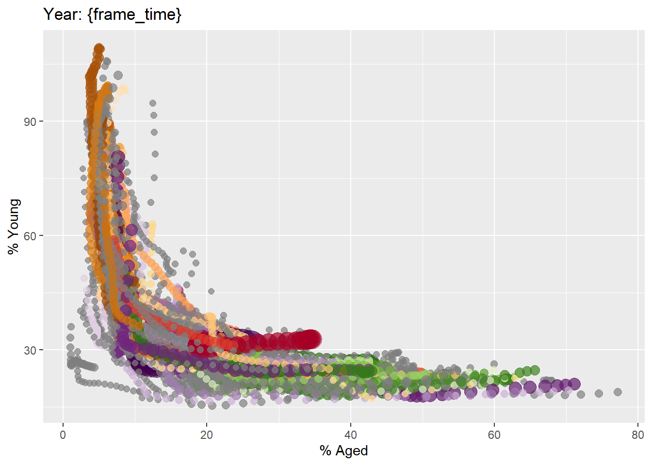
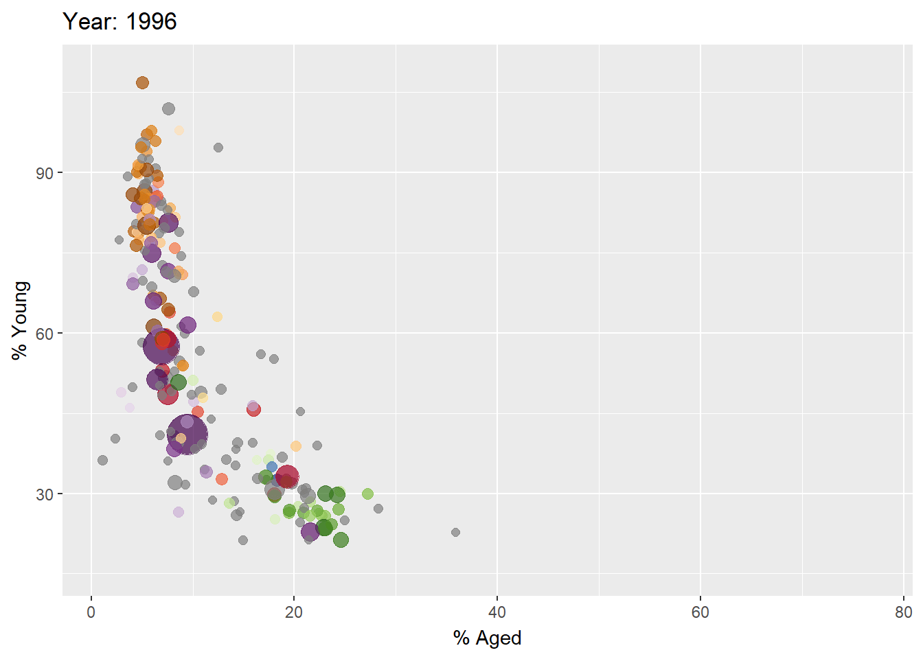
Basics of animation using gganimate

Some terminology associated with animated plots:

  1. Frame: In an animated line graph, each frame represents a different point in time or a different category. When the frame changes, the data points on the graph are updated to reflect the new data.

  2. Animation Attributes: The animation attributes are the settings that control how the animation behaves. For example, you can specify the duration of each frame, the easing function used to transition between frames, and whether to start the animation from the current frame or from the beginning.

Importing data

col <- c("Country", "Continent")
globalPop <- read_xls("data/data_03/GlobalPopulation.xls",
                      sheet="Data") %>%
  mutate_each_(funs(factor(.)), col) %>%
  mutate(Year = as.integer(Year))

First, we create a static bubble plot using our data:

  • Plot
  • Code

ggplot(globalPop, aes(x = Old, y = Young, 
                      size = Population, 
                      colour = Country)) +
  geom_point(alpha = 0.7, 
             show.legend = FALSE) +
  scale_colour_manual(values = country_colors) +
  scale_size(range = c(2, 12)) +
  labs(title = 'Year: {frame_time}', 
       x = '% Aged', 
       y = '% Young') 

Then, we add transition_time() and ease_aes() to create the animations:

  • Plot
  • Code

ggplot(globalPop, aes(x = Old, y = Young, 
                      size = Population, 
                      colour = Country)) +
  geom_point(alpha = 0.7, 
             show.legend = FALSE) +
  scale_colour_manual(values = country_colors) +
  scale_size(range = c(2, 12)) +
  labs(title = 'Year: {frame_time}', 
       x = '% Aged', 
       y = '% Young') +
  transition_time(Year) +       
  ease_aes('linear')  

Basics of animation using ggplotly()

This is done using the frame argument within the aesthetics (not executed to save render time).

Example code:

```{r}
gg <- ggplot(globalPop, 
       aes(x = Old, 
           y = Young, 
           size = Population, 
           colour = Country)) +
  geom_point(aes(size = Population,
                 frame = Year),
             alpha = 0.7, 
             show.legend = FALSE) +
  scale_colour_manual(values = country_colors) +
  scale_size(range = c(2, 12)) +
  labs(x = '% Aged', 
       y = '% Young')

ggplotly(gg)
```
`frame =` argument

Note the frame = argument within the geom_point’s aesthetics, specifying that the animation should be done across Year.

Basics of animation using plot_ly()

This is also done using the frame argument (not executed to save render time):

```{r}
bp <- globalPop %>%
  plot_ly(x = ~Old, 
          y = ~Young, 
          size = ~Population, 
          color = ~Continent, 
          frame = ~Year, 
          text = ~Country, 
          hoverinfo = "text",
          type = 'scatter',
          mode = 'markers'
          )
bp
```